This is part four in a series:
- Part 1, Introduction
- Part 2, Local Data
- Part 3, Getting Around
- Part 4, Data Sets
- Part 5, Resources
Besides just looking around at geographical features like states, roads, and buildings, we can incorporate human-centric data like restaurants, crimes, and more.
Data Sets
1. Toxic Release Inventory
A “TRI” as reported by the EPA is a Toxic Release Inventory. This could be a chemical spill or some other accident that’s not in our best health interests. Here are the incidents that took place in Kentucky over a ten-year period.
select geometry::CollectionAggregate(geom)
from ky_counties
union all
select geom.STBuffer(.05)
from ky_tri
where geom.STWithin((select geom from us_stateshapes where state = 'KY')) = 1
The EPA offers an interactive map of TRI’s around the country here.

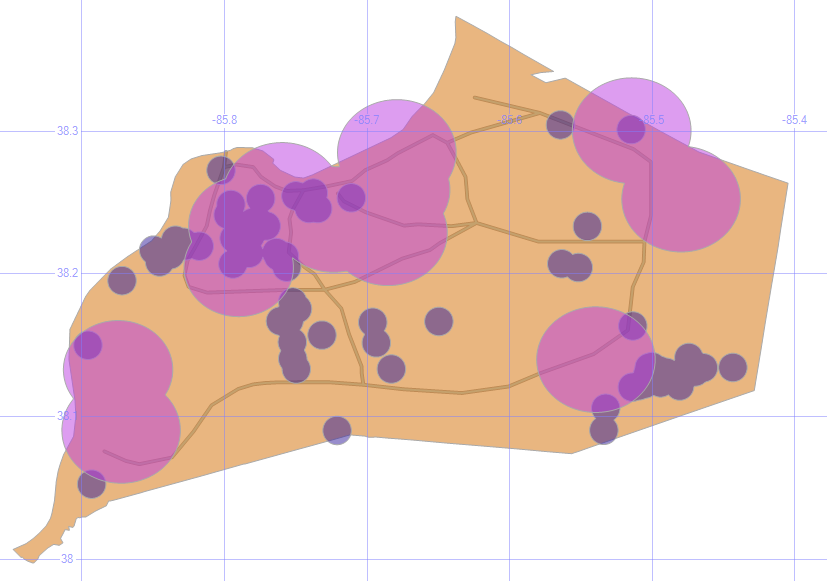
2. Toxic Incidents in Jefferson County
select geometry::CollectionAggregate(geom).STBuffer(.001)
from ky_interstates where geom.STWithin((select geom from ky_counties where id = 24)) = 1
union all
select geometry::CollectionAggregate(geom) from ky_counties where id = 24
union all
select geom.STBuffer(.01) from ky_tri where geom.STWithin((select geom from ky_counties where id = 24)) = 1
Bringing it close to home, here are the incidents that have taken place in my own hometown of Louisville, KY.

3. Add in the Sirens
select geometry::CollectionAggregate(geom).STBuffer(.001)
from ky_interstates where geom.STWithin((select geom from ky_counties where id = 24)) = 1
union all
select geom from ky_counties where id = 24
union all
select geometry::UnionAggregate(geom.STBuffer(.01)) from ky_tri where geom.STWithin((select geom from ky_counties where id = 24)) = 1
union all
select geometry::UnionAggregate(geom.STBuffer(.02)) from ky_sirens
The siren radius is an estimate, since the hearing distance can depend on a lot of factors. Still, it’s disturbing to see that there are some parts of the county that have had several incidents but have no sirens for tens of miles. The I-65 corridor on the southern half of Louisville has its share of problems, but no active alert system.
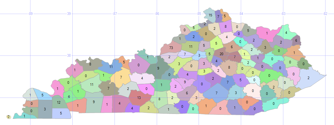
4. Toxic Incidents per County
;with tox (id, ct) as
(select c.id, count(*) from ky_counties c join ky_tri t on c.geom.STContains(t.geom) = 1 group by c.id)
select c.geom, isnull(tox.ct,0) Incidents
from ky_counties c
left outer join tox on c.id = tox.id
By counting the number of incidents per county in a CTE, and joining that to the county map, we can display that number on the SQL map.
On the good side, it’s good to see that there are several counties with zero incidents; on the bad side, 73 in my county? Ouch.
5. Toxic Incident Range Bands
select geometry::CollectionAggregate(geom), '0' Incidents
from ky_counties c where c.id not in (select id from tox) union all
select geometry::CollectionAggregate(geom), '< 5'
from ky_counties c inner join tox on tox.id = c.id where tox.ct < 5 union all
select geometry::CollectionAggregate(geom), '5 - 10'
from ky_counties c inner join tox on tox.id = c.id where tox.ct between 5 and 10 union all
select geometry::CollectionAggregate(geom), '11 - 25'
from ky_counties c inner join tox on tox.id = c.id where tox.ct between 11 and 25 union all
select geometry::CollectionAggregate(geom), '> 25'
from ky_counties c inner join tox on tox.id = c.id where tox.ct > 25
Seeing the individual numbers is informative, but divvying up the data into range bands can make it easier to find patterns and trends.
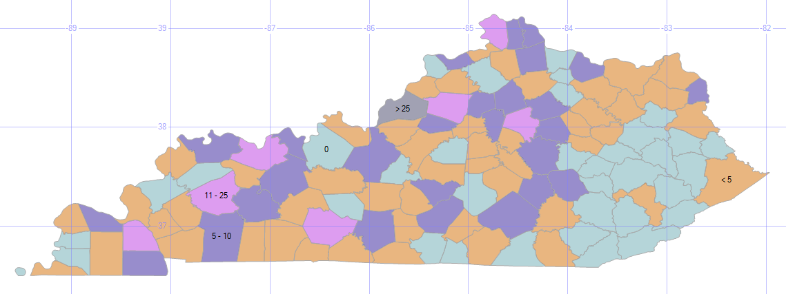
Since we aggregated the counts into just five range bands, they’re considered just five objects, and therefore only five labels appear.
The southeast part of the state looks pretty good, with mostly light blue zeros and a scattering of tan lows. There’s an almost solid dark blue of tens riding up along I-75. And, if I had to present this kind of bad news to my boss, you can see that I’ve cleverly downplayed Louisville’s 73 TRIs into an “over 25” category.
6. Low Food Scores
;with s (id, dt) as
(select establishmentid, max(inspectiondate) from ky_food
where typedescription = 'food service' group by establishmentid)
select geom.STBuffer(.01) Geom, establishmentname + ': ' + convert(varchar,f.score) Name
from ky_food f
inner join s on f.establishmentid = s.id and f.inspectiondate = s.dt
where score < 90
union all
select geometry::CollectionAggregate(geom), ''
from ky_interstates where geom.STWithin((select geom from ky_counties where id = 24)) = 1
union all
select geom.STBoundary(), '' from ky_counties where id = 24
Instead of the bad stuff that we may inadvertently breathe and drink due to industrial accidents or chemical spills, let’s look at the bad stuff that we put into our bodies on purpose. Here are the restaurant health inspection codes (usually the “A” papers that we see posted) that are not up to the A level (score < 90).
Here, I’m plotting the low-grade restaurants (using a CTE because I only want the most recent inspection date for each restaurant) around the city, and setting the hover-text to be the name and score.
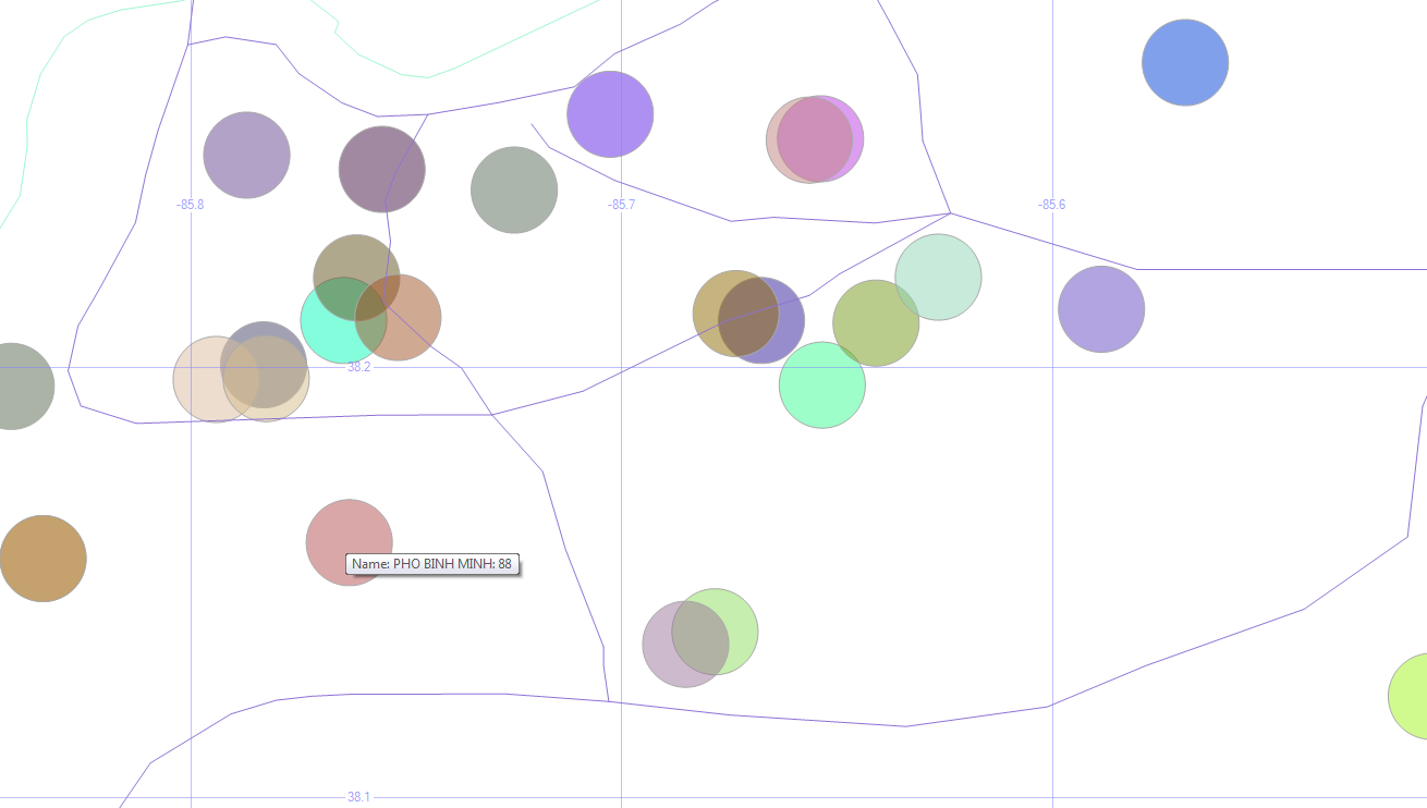
The data I’m using is from early 2015. So Phi Binh Minh (and the others) might have an “A” in the window these days. Don’t take my map as a food critic review.
7. Violent Crimes in Jefferson County
select geom.STBuffer(.001), left(Crime,1) Crime, convert(varchar,IncidentDate,111) Date
from ky_crime
where geom.STWithin((select geom from ky_counties where id = 24)) = 1
and crime in ('homicide', 'aggravated assault', 'simple assault') and year(incidentdate) = 2014
union all
select geometry::CollectionAggregate(geom), null, null
from ky_interstates where geom.STWithin((select geom from ky_counties where id = 24)) = 1
union all
select geom.STBoundary(), null, null from ky_counties where id = 24
More bad news! Sorry.
Here are the violent crimes in town (thankfully, relatively few homicides) over the course of a year, with the first letter of each of those crimes in our hover-text.

The west end, downtown, and the airport region seem to have the worst of it.
8. Violent Crimes in Jefferson County with Bubble Sizes
;with siz (lat, lon, sz) as
(select latitude, longitude, count(*) size from ky_crime where crime in ('homicide', 'aggravated assault', 'simple assault') group by latitude, longitude)
select geom.STBuffer(sz * .0003) from ky_crime c
inner join siz on c.latitude = siz.lat and c.longitude = siz.lon
where crime in ('homicide', 'aggravated assault', 'simple assault')
and geom.STWithin((select geom from ky_counties where id = 24)) = 1 and sz > 1
union all
select geometry::CollectionAggregate(geom)
from ky_interstates where geom.STWithin((select geom from ky_counties where id = 24)) = 1
union all
select geom.STBoundary() from ky_counties where id = 24
Instead of just seeing where they are, how about we highlight the dangerous parts of town by making each dot (an address where a crime happened) wider for every crime that happened there, and ignore the dots where only one crime happened. The previous maps showed us which parts of town are dangerous, but this shows us which specific places are “repeat customers” for crimes.
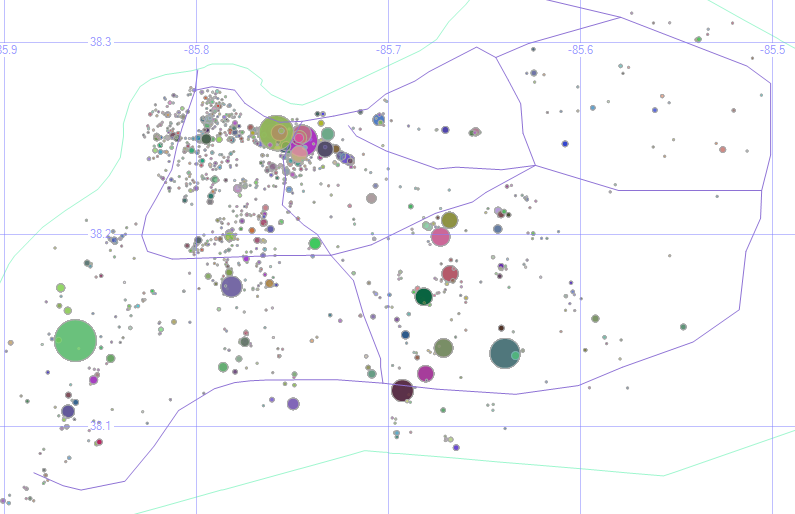
Of course, even one violent crime is too many. And my filename for this image (KY Crime Bubbles) sounds like a street gang made up of clowns or janitors.
The underlying data shows that one of the larger circles could actually be removed. The puke-green circle around the center of the second grid square is some sort of default address for the city. The address is listed simply as “Louisville Metro.” Even so, we learn a lot by plotting our own data on a map like this.
9. Reported Crimes (Bad Geo)
select geom.STBuffer(.5), crime, convert(varchar,IncidentDate,111) Date
from ky_crime
where geom.STWithin((select geom from us_stateshapes where state = 'KY')) = 0
union all
select geometry::CollectionAggregate(geom), null, null from us_stateshapes
So far, I’ve been limited the data displayed just to what happens within Louisville/Jefferson County, but sometimes crimes get reported to the Louisville Metro Police that take place out of town.
Oh, and there are a lot of crimes (32 of them, not all that many compared to the overall volume, really) that happen way out in the middle of the ocean. Actually, no. That’s location 0, 0 (one of those 0’s is the equator, and the other is the prime meridian, which is also where the GMT time zone starts). If no geodata was recorded with the incident, many systems will default it to there. For data like that, you can ignore it or correct it by geocoding it (assigning a latitude and longitude to an address). There are some services that will do that for free, for a given amount of addresses (google maps will geocode 10,000 per day, for example), and other services that will geocode for a fee.
Data Sources
Here are the data sets use for this lesson (the us_stateshapes, ky_counties, and ky_interstates have appeared previously.)
Getting Involved
I encourage all of you to join in this year’s National Day of Civic Hacking, which is sponsored by the White House’s data.gov open data portal. It’s an annual event put on by the Code for America Brigade to build apps in a single day with other local coders / designers / data’ers, primarily based on using open data sets.
In Louisville, in the past few years, we’ve had apps that:
- rate the safety of the neighborhood you’re in
- find a particular adoptable animal close to you
- aggregate techie calendars from meetup, eventbrite, and more
- and dozens more
Your area might also have a chapter of MapTime, which uses and enhances geodata in a variety of ways.
